Blake sprite COMPLETE overhaul
As the title says, Blake's sprite has been completely reworked from the ground up. I wasn't happy with the old sprite at all.
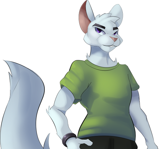
OLD

His face shape was weird. His eyes were very strangely shaped. They were too big and at a weird angle and just overall didn't fit in with anyone else's. His anatomy had some issues. He didn't really look like he fit in with any of the other characters. On top of that, there wasn't really a good way Sarah would be able to make expression sprites due to these issues. His head would've needed to be reworked regardless. His pose also made him look very tense, which again, wouldn't work well for different expressions. That's the reason he's remained the only character with one expression so far (at least out of ones that have been seen in-game). I've also never once heard anything positive said about how he looked so it seemed like a good time to scrap the old design and start fresh.
And thus, Sarah and I talked and planned stuff out for how his new sprite should look. Then change after change kept happening until poof, we've got his new design.
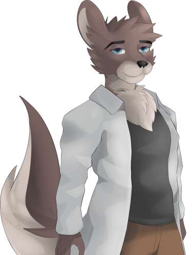
NEW

He looks nothing like his old self anymore. Sarah wanted to draw chest fluff, therefore he has some. I wanted his fur to be slightly brownish rather than pure white. That somehow turned into full-on brown, but I think it looks good. Chinchillas have puffy cheeks, but I didn't like how it looked on his old sprite at all so that was changed. I wanted him in a more relaxed pose and so now he is. Sarah tried making his clothes the same color as before but it didn't look good with his new looks. I was also wanting something that wasn't just a plain t-shirt since I've been wanting more variety lately, so I suggested a lab coat. It makes sense he'd wear one considering he calls his work a lab even if it isn't a lab at all. We tried several different shirt and pants color combinations since it was hard to decide on what looked best. At one point he had a pink shirt. Later it was purple. Then for a while he had a blue shirt and green pants. In the end we went with black shirt and brown pants. Eye color was the last thing. I wanted to keep a purple eye color but for some reason it wasn't looking good at all, so we went with blue instead.
And there you have it. Out of the three characters with sprite reworks (Jeffrey, Meimaru, and Blake), this is the biggest change. I like it, personally. All that's left for him will be expression sprites.
There will likely be changes to other characters' sprites in the future, but it should be minor stuff. I've also told Sarah that I'd like some edits to expression sprites for some characters. Some don't look expressive enough, so I'm wanting to have things done like ears moving and stuff like that for some characters who don't already have that. Daren and Sean are the main two.
Anyways yeah, see ya!
Get Fueled by Insanity
Fueled by Insanity
There are some things you can't run away from...
| Status | In development |
| Author | Xarishro |
| Genre | Visual Novel |
| Tags | Furry, Gay, Horror, LGBT, Meaningful Choices, Ren'Py, Slice Of Life |
More posts
- Hiatus23 days ago
- Sorry for not making a post for a whileJun 08, 2025
- April 1st thingyApr 01, 2025
- Life stuff going onMar 15, 2025
- Fueled by Insanity 0.17 UpdateJan 15, 2025
- Back to writing again!Dec 22, 2024
- I should hopefully be able to do stuff soonNov 14, 2024
- Status UpdateAug 31, 2024
- Life UpdateJul 01, 2024
- Plans for the momentApr 30, 2024

Comments
Log in with itch.io to leave a comment.
Good job with the redesign. I agree this character was just 'there' and the art wasn't bad, but just felt like a placeholder. My only complaint is that the folds and shadows on his coat look weird--too much like he's wearing polygons.